Session 55: Label Art
 I pay a lot of attention to label art for both beer and records. The album cover is one of the most revered pieces of accidental art/marketing ploys in modern history. However, I don’t know that I’ve ever really written about either all that much. Regardless, for this month’s session, we’re writing about label art. This month’s host is Hop Head Said… Basically, the goal is to choose one’s favorite artwork as depicted on bottles, cans, caps, and coasters.
This was a difficult choice to make. I love so many different craft beer labels. It’s hard just to choose one. I collect Stone bottles as I love the entire approach they have for marketing their beers. It used to be more difficult to accumulate these bottles before they came to Missouri. Now, it’s much, much easier.
I considered Mikkeller and Stillwater. I actually met the guy behind Stillwater’s artwork, tattoo artist Lee Verzosa, and he’s a nice guy. However, I write a lot about these breweries and figured it would be hard just to choose one label that rose above the rest.
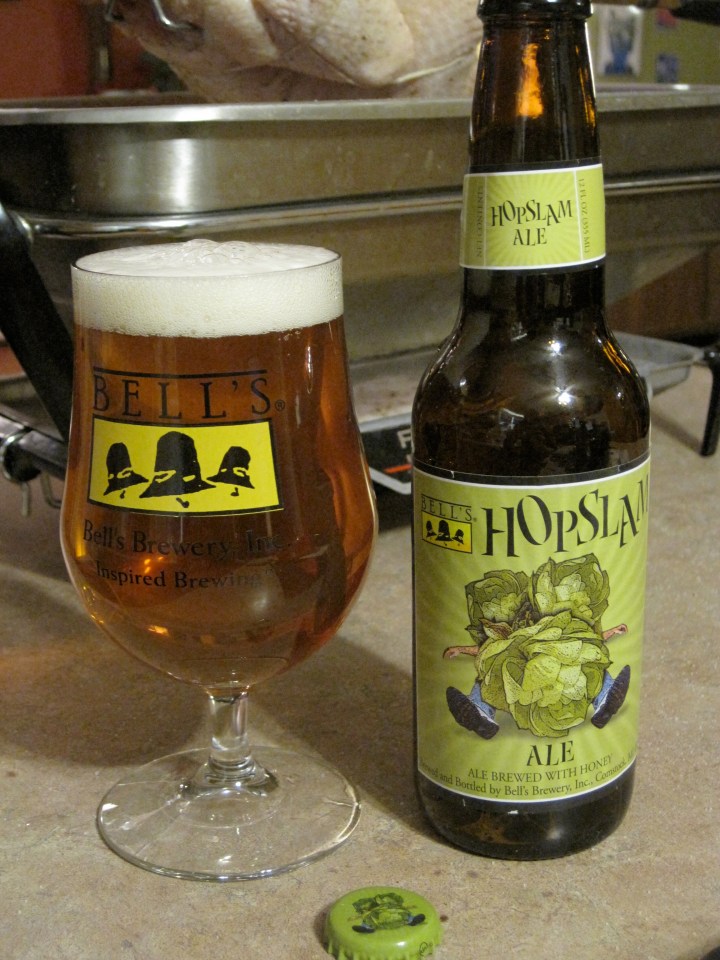
Then, I considered the beer label that answered my prayers. It was a Friday after a long week of work. I wanted to sit back with a good beer. In fact, I had recently rediscovered my preference for really hoppy IPA’s. So, I went to the store in search of the hoppiest thing I could find. It so happens that Bell’s Hopslam had recently arrived. It’s label featuring a man being crushed by some giant hops was the sign for which I was looking. The rest is history.
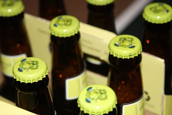
Has there ever been a better image to represent the recent progression to bigger and hoppier beers? The image perfectly encapsulates this trend and matches the name perfectly. The beer itself is much more nuanced than the name Hopslam would suggest, but the image does the trick in warning consumers of the hop bomb within. Here are a couple images I’ve used of the infamous label and caps (which were a new touch this year).


I pay a lot of attention to label art, too. On beer only, though. I love the artwork done by Marq Spusta for Dogfish Head. Here are three labels he signed for me that I used as a contest giveaway a few months back. http://www.dailybeerreview.com/2011/07/1000th-post-scavenger-hunt.html He has also done prints for their seasonal beers, though they are not the beer labels.
But the first thing that came to mind when I saw the post title and your leaning toward hoppy beers was the artwork of Sierra Nevada, specifically on their Estate Homegrown Ale bottle. http://www.dailybeerreview.com/2010/10/sierra-nevada-estate-homegrown-ale.html. Their Life and Limb bottle I recently grabbed is also beautiful.
Hope you don’t mind the linking since it’s hard to make a point with no pics.
Linking’s cool. Yeah, I love the Dogfish Head stuff. I think they get a bad rap for being gimmicky and for Sam being cheesy, but the overall quality of their product is unmatched, particularly the labels. Those Sierra Nevada labels are pretty cool as well. Thanks for commenting, links and all.
Also, I just had the Hellhound (among ~30 beers at a tasting) and it stood out among many great beers. Good stuff, that.
It is the best of both worlds today when the beer you pick to blog about has a label and a cap that fulfills the Session writing assignment. Thanks for participating!
Thanks for running the show. I was going to do an elaborate post, but it seemed more appropriate to do something simple.
Yo BOC!
Such a timely article! I am no stranger to buying a beer cause I liked the label. If label design didn’t work, they wouldn’t spend the money on such silly things as graphic artists. And your assessment of the Bell’s Hopslam is 100% correct. Not as over the top hoppy as you would expect. Same goes for Lagunitas Hop Stoopid. Hoppy for sure, but in a subtle, refined, and VERY drinkable way!
Regarding labels, I really like the label art from these brewers:
Rising Tide Brewery – http://www.risingtidebrewing.com/beers.html
Cigar City Brewing – http://www.cigarcitybrewing.com/Cigar_City_Beer/Welcome_to_Cigar_City_Beer_in_Tampa_Florida_Our_Beers.html
Smuttynose – http://smuttynose.com/beers/
Enjoy!
G-LO
Thanks! While I don’t buy beers solely for the label art, it does factor into my decision. I figure that the time and attention spent on a label suggests a similar approach to the beer within. Sometimes, I like to look through my cellar at the labels like I used to look through my baseball cards when I was a kid.
It’s funny, a beer I’m reviewing this weekend has some amazing artwork to it. Check out Dieu du Ciel – Rigor Mortis. It’s totally the name and the label that made me want to buy it. Someone could have peed in it and I’d probably still be interested.
Yeah, their labels are pretty cool. I’ll keep an eye out for your review.
[…] where beer bloggers from all over wrote on the same topic. That same year (2011), I wrote fondly of Hopslam’s iconic artwork. What can I say? I was […]